Thursday, 17 February 2011

Textual analysis and deconstruction of an existing music magazine 2


The colours that really stand out on this magazine cover are red, white, and grey. This is because the title logo is white text with a red background and the main headline, 'Liam's beady eye kick off' is in red and white text. The main focus picture of this front cover is the close up head shot of Liam Gallagher, this can emphasize that the issue is mainly focused on Liam. The cover has tag lines which gives the reader an indication of the contents of the magazine. For example, there is a large tag line with the band name, 'Noah and the whale, your new favourite band'. Tag lines make the magazine more attractive to buy, as a potential reader and fan sees the band name, they are more inclined to buy the magazine.

Wednesday, 16 February 2011

Summary post of what conventions i have learnt so far and what i may include in my final piece.

So far, i have learnt that most music magazine titles are related to music. For example, 'Kerrang!' could be an onomatopoeic word for the sound that a guitar makes. All front covers of music magazine feature a band or artist as the main focus picture. This is to entice the potential readers into buying the magazine. Usually, this picture is a close-up or a medium close up. Next, there are a lot of bold colours and fonts that are used, and usually in a colour scheme of three.
I my final piece, i wish to use a main focus picture on my front cover, with the magazine title above it. After i have done this, i am going to use headlines and tag lines about different stories. Finally, to complete the magazine cover, i will put on some incentives for the readers. For example, free music downloads.

Textual analysis and deconstruction of an existing magazine cover.


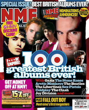
This magazine cover is very typical of an NME one. This is because, firstly, it has its title in the usual place with the usual font and colour. Although the image on the front does not have a specific band or artist, it was a variety of artists as this issue of NME was dedicated to 'the greatest 100 albums ever'. According to this magazine cover, the issue offered incentives to its audience; a HMV discount card, and the chance to win tickets to the NME awards tour. The headline, '100 greatest British albums ever', is in a large font so that it can be read from a distance away and attracts attention of potential readers. Another thing which attracts the reader's attention is the bold colours used on the magazine cover. The background is a union jack which consists of the bold colours, red, navy blue and white, and on top of this the text is written in light blue and magenta. Below the headline, there is a list of bands and artists who could potentially appear in the 100 albums countdown. When the reader or sees this on the cover, they are more inclined to buy the issue if they find these bands/artists appealing.

Wednesday, 9 February 2011

Research Methods

There are four main types of research methods that are used when creating a new music magazine. These are, primary, secondary, quantitive, and qualitive.

Primary

Primary research includes methods such as questionnaires, interviews, polls, survays, focus groups, email, text. phonecalls, social networking, and letters. This is research that finds out information first hand.

Secondary

Secondary research includes, internet, media theory books, industry and individuals websites, magazines, newspapers, and textual analysis. This type of research is where the information is found from other sources.

Quantitive

Quantitive research aims to look for patterns and trends in the results of methods, such as, questionnaires and survays.

Qualitive

Qualitive research aims to find out peoples opinions on subject matters. For example, in newpaper articles and focus groups.


When i do my research before creating my magazine, i am going to use questionnaires, magazines and interviews to find out the information i need. I could have used sources such as text books, but these would not give me the detailed information i am looking for.

Wednesday, 2 February 2011

Research on two music magazines currently on sale in Britain

NME and Kerrang are two music magazines on sale in Britan, which are both based on two different music genres. I have researched these magazines and found out the followng;

NME

Brief history; NME stands for the New Musical Express, and was first published in march 1952. In the 1960s the magazine became very popular due to frequently due to it regularly featuring groups such as The Rolling Stones and The Beatles on the front cover. During the 1970s, NME was the best selling music magazine in Britain. A major milestone in the history of NME, was when they offered a reader incentive to its audience. This was a cassette tape that was available for readers to buy at a discount price.

Typical content; The typical content of NME includes: music charts, music reviews, cocert dates, music news, upcoming bands/artists, albums and reviews, movies.

Typica reader; On average, around three times more men than women read NME magazine. The average age for NME readers is between the ages of 15-44.

Housestyle;The title on the front cover is always in a big font and has capital letters. This is to make it stand out and to help catch the readers eye. Also, the red colour of the title font is typical of every issue and is part of the magazines housestyle. Therefore, the magazine is very noticable to its regular readers.

How social groups are represented; I think this magazine is aimed at mainly males between the ages of 16-40. However, many women still read this magazine regularly. The reason i think this is because, the type of music that is featured, is mainly associated with females.

KERRANG

Brief history; Kerrang was first published on the 7th june, 1981 and it was edited by Geoff Barton. This issue of kerrang was only intended as a one off supplement which focused on the new wave of heavy rock music in the UK, in 'Sounds' newspaper. AC/DC was the band which was first ever featured on the cover of Kerrang.

Typical content; rock music chart, music reviews, cocert dates, music news, upcoming bands/artists, albums and reviews, movies.

Typical reader; Roughly, around three times as many men than women read Kerrang. Also, just over 14 times as many people aged between the ages of 15-44, read Kerrang than people aged 44+.

House style; All the titles in Kerrang are usually the same font and colour, mainly red, yellow or black. The title is always at the top of the front page and below it is a picture of a band.

How social groups are represented; Kerrang is mainly aimed at males who are interested in heavy rock culture and music. However, there are women interested in this that also read the magazine.

this information came from various websites including, Wikipedia, NME.com and Kerrang.com

Monday, 31 January 2011

Music magazine terminology

To create my final music magazine cast, i will have a to use a new range of terminology. There are:
  • Balance- the design principle that one side of a layout must be given equal weight compared to another. Balance is achieved through the placement of type and graphic elements.
  • Banner- the place where a magazines logo appears.
  • Body copy- the main text of an article.
  • Brand- the magazine is a 'brand', in the same way as GAP or Levis is a brand. With growth of synergy, a magazine might have spin off products such as a radio station, TV channel. clothing line or merchandise.
  • Bullet- a circle or dingbat before each item on a list.
  • Byline- the name of an articles author.
  • Callout- explanation of a specific area of an illistration or diagram.
  • Caption- also called a cutline.
  • Consistency- the principle that a magazine should retain some elements throughout an edition of a magazine and also from month to month. Inconsistency in typeface, design, layout etc. can confuse and alienate readers.
  • contrast- the principle that important elements are given emphasis on a page through the use of size, colour, texture or placement whilst less important elements are minimised.
  • copy- the written text.
  • Cover- divided into OFC, IFC.
  • Cover lines- also known as sell lines, the lines on the front cover that advertise the contents.
  • Crop- to cut or trim an image.
  • Deck- text below a headline that summarises or provides a lead-in to the article.
  • Display type- that is a larger than body copy, such as a subheading and pull quotes.
  • Drop cap- the large letter, like illuminated writing, sometimes found as the first letter of an article.
  • Font- all the sizes and styles of text.
  • Fours fs- Format, formula, frame, function
  • Glossy- a magazine with glossy pages.
  • Graphic- the visual elements of the magazine like the illustrations and photographs.
  • Grid- an invisible structure that guides the placement of graphics and text on a page.
  • Logotype or logo- the name of the magazine, also known as the flag. Found in the banner space, but often repeated elsewhere, like on the contents page.
  • Margin- the measured white space at the top, bottom, left and right edges of the text. If any thing goes over the margins it is said to 'bleed'
  • Masthead- a box, usually about a column wide, that lists the magazine's editors, designers, business staff and information about the publishing company.
  • Matte- a dull, unglossy finished page.
  • Montage- the assembly of several photos or illustrations into a single piece of art.
  • Pagination- the process of creating complete page layouts and putting them in order using DTP.
  • Palette- a set of colours that can be used in a magazine, defined in advance to ensure a consistent look and brand from issue to issue.
  • Pull quote- an excerpt from an article, often a quotation from an interview, that has been pulled out, enlarged and used as a design element to break up body text.
  • Sans serif- a font without feet.
  • Sequence- the design principle that the designer can choose the order in which readers look at items on a page, using size, colour, shape and placement.
  • Serif- a font that has feet.
  • Slab serif- a typeface using heavy, even serifs.
  • Subhead- a short headline used to break up paragraphs within body copy.
  • Subtitle- a heading beneath the logotype that acts as the magazines motto.
  • Typeface- a style of font or type.
  • Unity- a consistency in design style throughout the magazine.

Wednesday, 26 January 2011

preliminary progress 26/01/11

For the preliminary exercise so far we have:

  • Looked on the internet and in the library at other existing school/college magazines to look at inspirational ideas for our own magazine.

  • Taken our medium close up picture to use for our front cover image.
  • Considered in our group, some headlines and text to also go on the front cover.
For example, 'exam tips', 'revision techniques'

We are now aiming to start putting our front page together with the final headlines and text we choose.